

The Art of Seeing: A Visual Guide to Understanding Renaissance Paintings
- Yana Evans
- Aug 13, 2025
- 15 min read
Updated: Feb 12
CONTENTS:
Continue reading: Part II - Case Study: Analysis of Botticelli Primavera Painting
To understand what Renaissance paintings meant to their original viewers, we must learn to read their visual language. When we truly see, not just look, a painting becomes more than a beautiful object. It transforms into a portal: a passage into the world and mind of its maker.
This article is an invitation to begin that kind of seeing. Through the lens of the Renaissance, we’ll explore the world behind the canvas: the costly pigments and rare materials, the political power plays behind commissions, the revolutionary techniques of the era, the symbolic weight of clothing and gesture, and the local “dialects” of style that distinguished one region from another.
Renaissance paintings didn’t emerge from a vacuum. They were shaped by their time, by art workshops and patrons, religious institutions and humanist ideals, shifting tastes and technical innovations. By unpacking these layers, you’ll gain not just visual literacy, but the tools to decode the deeper meanings embedded in classical art.
By the end, what once seemed distant or decorative will feel vivid, complex, and alive, and your experience of looking will be forever changed.
Material Meaning: Pigments, Textiles, and Symbolic Wealth

Renaissance paintings were often as much displays of wealth as they were works of beauty. The materials an artist used could carry powerful meaning. For example, certain pigments were literally worth a fortune - ultramarine blue, made from lapis lazuli mined in present-day Afghanistan, was imported through long trade routes and cost more than gold in 15th-century Europe.
Patrons would bankroll this extravagant blue for the most important figures like the robes of the Virgin Mary to signal piety and prestige. Likewise, painters lavished gold leaf and gleaming pigments on halos, fabrics, and skies to give a supernatural splendor to religious scenes – and to advertise the patron’s generosity to God. Colors were symbolic - white for purity, red for passion or the blood of Christ, green for hope, black for death or humility.
Textiles also signaled luxury. Artists flaunted both their skill and their patron’s prestige through gleaming silks, velvet fur, and exotic imports. Imported oriental carpets weren’t mere decoration; they were strategic displays of global trade access, elite taste, and aristocratic wealth. Only the elite could afford such items, so when a patron had a precious Turkish carpet painted beneath the feet of a noble’s table, it was a flex of status.


From left to right: Giovanni Bellini - Lochis Madonna circa 1476, appears in lapis lazuli; Titian - Portrait of a Man in a Red Cap appears in expensive fur and velvet fabrics; Lorenzo Lotto – Portrait of a Young Man in His Study with golden jewelry and oriental fabrics on his table.
Even everyday objects in a scene – a silver urn, a gold brooch, a bowl of exotic fruit – were carefully chosen indicators of prosperity or metaphorical meaning. A Renaissance viewer, educated by sermons and emblem books, unlike a casual modern viewer, would immediately recognize ultramarine blue or a sumptuous brocade gown as a sign of the subject’s importance. Today, we might need a guide or some hints to decode them – but once you start recognizing these symbols, it’s like solving a delightful puzzle that the artist laid out for you.
Power and Patronage
Behind every great Renaissance artwork is often a great patron. During this era, art was commonly commissioned by wealthy families, churches, or civic leaders – and the very act of commissioning art was a statement of power. A painting or sculpture in 1500s Florence told you not just about biblical stories or mythic legends, but about who paid for it and why. Commissioning an artwork was, in itself, a reflection of the patron’s refinement, knowledge, wealth, and aspirations. In other words, art was a social and political advertisement.
Patrons like the Medici of Florence understood this well. The Medici bankrolled works from Botticelli’s Birth of Venus to Michelangelo’s David, partly to glorify their city and lineage. By funding magnificent paintings and palaces, they bolstered their family’s authority and cultivated an image as enlightened Renaissance princes. Similarly, popes and princes across Italy (the Borgias in Rome, the Sforzas in Milan, etc.) used art as propaganda – decorating chapels, plazas, and halls with imagery that reinforced their divine right or cultured taste. Patrons often inserted themselves or their emblems into the art: a donor’s portrait might kneel in a corner of an altarpiece, or a family coat-of-arms might adorn the painting’s frame or a motif within it.


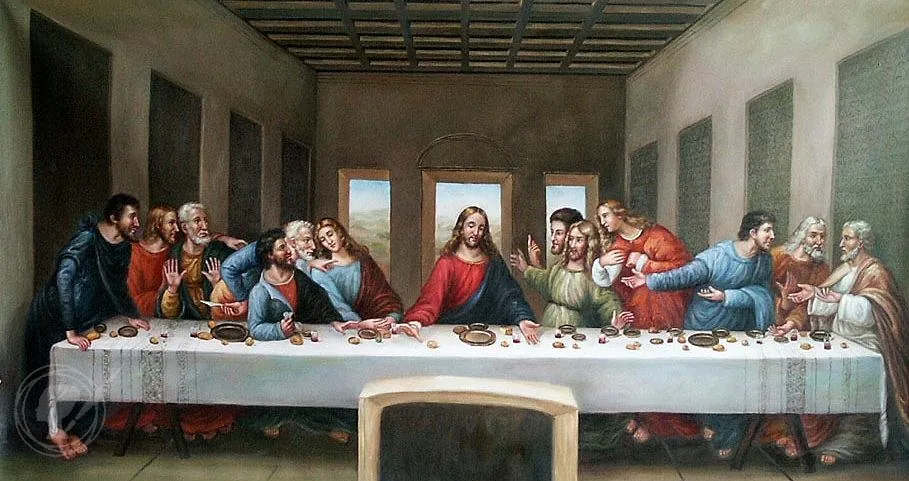
From left to right: the Borgia Apartments in the Apostolic Palace in the Vatican, painted by Pinturicchio (1492–1494); Leonardo da Vinci’s The Last Supper (1495–1498) commissioned by Sforzas.
What does this mean for us as viewers? A Renaissance painting is more than an image it’s also a product of a power dynamic. Knowing who commissioned a work and what they hoped to communicate enriches our understanding. Many works were essentially messages. As art historian Richard Stemp puts it, “the vast majority of works in the Renaissance were created to communicate some sort of message… sometimes that message was quite specifically about the power of the patrons”.
For example, a fresco cycle might subtly compare a ruler to a biblical hero, or a private portrait might emphasize the sitter’s wealth by depicting them with refined books and instruments, signaling learning and virtue. Patrons competed — if one noblewoman built a splendid chapel, her rival sought to outshine it. This patronage system also elevated the status of artists from anonymous craftsmen to celebrated creators. Giorgio Vasari’s "Lives of the Most Excellent Painters, Sculptors, and Architects", published in 1550, helped canonize figures like Michelangelo and Leonardo as singular geniuses — a view of artists that still shapes how we think about creativity today.
Next time you stand before a Renaissance painting, consider the patron’s invisible hand. Ask: Who wanted this image, and for what occasion? Was it a wedding gift, a church altarpiece, a tribute to a guild? Often the answers transform the painting into a piece of a historical puzzle – a clue to the social and political currents of its time.
Tools, Techniques, and Innovations
The Renaissance earned its name (“rebirth”) in part through groundbreaking artistic innovations. In the 1400s and 1500s, art was evolving at lightning speed.

Around 1420, artists in Florence notably Filippo Brunelleschi and Masaccio began applying the mathematical system of linear perspective, a discovery that transformed visual storytelling. For the first time, paintings showed convincing depth: temple interiors, tiled floors, or distant hills appeared to recede naturally into space. This illusionistic depth allowed biblical scenes and mythological narratives to unfold in spatially coherent, almost cinematic environments.
With perspective came new mastery of light and shadow. Artists refined chiaroscuro, the contrast of light and dark and sfumato, the soft blending of tones to give figures depth and lifelike softness. Alongside with the knowledge acquired during dissections artist gained better understanding of musculature and bone structure, bringing even more realism to the human figure, became more naturalistic compared to the stiff figures of medieval art. While Leonardo da Vinci helped define these techniques, painters like Correggio and Titian pushed them further, using light to model form and evoke emotion. Faces began to glow, drapery gained weight, and paintings took on a quiet, tangible realism.


Left to right: The Crowning with Thorns by Caravaggio, 1604; The Crowning with Thorns by Titian ,1542
Early Renaissance painters primarily used egg tempera (pigments mixed with egg yolk) on wooden panels, which dried quickly and produced opaque, matte colors. But as the years went on, a game-changer arrived from the north: oil paint. Oil as a medium allowed richer hues, greater detail, and the ability to build translucent glazes for luminous effects. In tempera, an artist had to work fast and in flat planes of color; with oils, artists could blend slowly, achieving soft gradients and intricate textures (the gleam of hair, the sparkle of a jewel, the fuzz of peach skin) that simply weren’t possible before.
In Venice, artists pioneered painting on canvas (a light, portable support) instead of heavy wood panels, which, combined with the humid climate, led to a blossoming of deep color and loose brushwork in the Venetian school. On the other hand fresco techniques adorned huge wall spaces (like Michelangelo’s Sistine Chapel) with durable, brilliant images painted onto wet plaster.
When you stand before a Renaissance painting, take a moment to appreciate these technical feats. Notice if the picture has a realistic depth – perhaps the tiles on a floor shrink into the distance or a landscape fades toward a horizon. Observe how the artist handles light: Is there a single light source casting shadows? Do faces have soft modeling or sharp contrast? Inspect the surface for brushstrokes or the layering of paint. These clues tell the story of innovation. Knowing that The Last Supper was one of the first experiments with mixed fresco and oil (with unfortunate results for its preservation), or that Botticelli’s graceful lines were achieved with fine brushes in quick-drying tempera, deepens our admiration. The Renaissance dramatically expanded the artist’s toolbox - transforming flat surfaces into illusions of space, flesh, and atmosphere.
Fashion, Gesture, and Iconography
Renaissance art is a visual language. To “read” a painting, you must pay attention to its iconography – the symbols, gestures, and costumes that would have spoken volumes to viewers of the time. In an era of widespread Christian faith and classical learning, painters assumed their audience knew certain stories and symbols. Thus, nearly everything in a classical painting is intentional and meaningful, from a tiny dog at a lady’s feet to the way a saint holds his hand.

Fashion in paintings often reflects the time and status of the figures. Even when portraying biblical or mythological characters, Renaissance artists often dressed them in the stylized garb of their own era. Partly this was practical – artists used local models and costumes – but it was also symbolic. For instance, the Virgin Mary in a Tuscan painting might wear the contemporary gown of a 15th-century noblewoman, subtly linking sacred story to the present day. At other times, painters decked figures in antique Roman robes or fantastical hybrids of classical dress and Renaissance couture, depending on the scene.
Either way, clothing signified identity: colors and styles denoted purity (the Virgin’s blue mantle, made with ultramarine, symbolized heaven and holiness), power (a patron saint in rich episcopal vestments), or profession (St. Peter can be seen in rough fisherman's attire, though in most cases idealised). Also, these artworks capture the fashions of their day like a historical document – the flowing sleeves, ornate headdresses, and patterned fabrics you see were often the height of fashion in Florence or Bruges. So a viewer attuned to fashion could date a scene or recognize the social rank of figures at a glance.
Gestures and poses in Renaissance art were never accidental. Artists were deeply attuned to the expressive capabilities of the human body, using hands, heads, and posture to encode meaning and guide interpretation.
One of the most common hand gestures was the raised index finger, signaling divine authority or communication. This pose appears frequently in religious art, from the preaching apostles in Giotto’s frescoes to Leonardo da Vinci’s St. John the Baptist, who gestures mysteriously toward heaven. Renaissance viewers, educated in the rhetoric of gesture (a key part of oratory training), would recognize this as a symbol of elevated truth or revelation. Manuals of the period, such as Quintilian’s Institutio Oratoria (widely read in the Renaissance), describe this gesture as one that "commands attention" and "directs the soul to higher things."
Other hand gestures carried equally specific meanings. The sign of benediction, two fingers raised and the other fingers folded, was standard in depictions of Christ and saints. An open palm with extended fingers often conveyed speech, persuasion, or command used by philosophers and angels alike. A finger pressed to the lips, derived from the Greco-Roman deity Harpocrates, connoted secrecy or meditative silence, especially in monastic scenes. Outstretched arms, clasped hands, or upturned palms conveyed emotion: supplication, grief, or divine appeal.


From left to right: Leonardo da Vinci - St John the Baptist (raised index finger, signaling divine authority or communication); Raphael - Madonna of the Goldfinch (alludes to Christ’s future crucifixion), Jan van Eyck - Arnolfini Portrait (dog often symbolizes fidelity or marital faithfulness).
Then there are the symbolic objects – the rich vocabulary of iconography.
A few examples: A tiny finch or goldfinch bird in a Madonna and Child painting isn’t just a cute pet - it alludes to Christ’s future crucifixion (by legend, the goldfinch symbolizes the Passion due to a red spot on its plumage). A dog often symbolizes fidelity or marital faithfulness, which is why a loyal pup sits at the feet of many a married couple in portraiture. A lily flower stands for purity and is almost a calling card of the angel Gabriel in Annunciation scenes (Gabriel offers Mary a lily as a sign of her purity). Fruits like apples or pomegranates can hint at forbidden knowledge or resurrection.
So when looking at a Renaissance painting, treat it like a scene in a play where every prop and motion has purpose. Notice where hands point or eyes gaze – the artist is directing your eyes through these cues. Take inventory of the animals, plants, and objects included: why a rose, why a skull, why a certain book? Often, a quick inquiry into these symbols (via a museum label or later research) will unravel layers of meaning. This transforms passive viewing into an interactive experience – you become a detective of art. Over time, you’ll start recognizing familiar motifs (say, keys = St. Peter, a lion = St. Mark, a flayed skin = St. Bartholomew) and appreciate the clever ways artists embedded messages for those “in the know.” It’s a reminder that paintings were not just images but texts to be read, rich in allegory and cultural context.
Geography and Artistic Dialects
Just as spoken language has dialects, the visual language of art had regional “accents” during the Renaissance. An Italian painting didn’t look quite like a Flemish painting; a Venetian work had a different flavor than a Florentine one. Appreciating these geographical differences adds another layer to seeing art – it helps you place a painting in space as well as time.
Consider the contrast between the Italian Renaissance and the Northern Renaissance.
Italian artists (Florence, Rome, Venice) led the way in idealized human forms, drawn from classical Greek and Roman models, and in the use of perspective and anatomical accuracy. They favored balanced compositions and often mythological or grand biblical subjects.
Even within Italy, Renaissance art spoke in distinct regional dialects. In Florence and Rome, artists emphasized disegno – careful drawing, clear contours, and balanced compositions built on preparatory sketches. Figures by painters like Raphael and Leonardo da Vinci were arranged in harmonious proportions, modeled with sculptural clarity and soft, smoky sfumato. This approach reflected an intellectual pursuit of order, ideal beauty, and classical restraint.
Venice, by contrast, developed its own language of colore: a sensuous, painterly style rooted in rich hues and atmospheric light. Artists such as Titian and Bellini, working in a humid lagoon environment, pioneered the use of oil paint on canvas (rather than the wood panels favored in Florence). Their forms emerged not from crisp lines but from layered tones and expressive brushwork. The result was a glowing, tactile surface – paintings that shimmer with mood and color. Venetian art often prioritized the emotional and visual experience over strict anatomical precision, embracing a looser, more lyrical aesthetic.
By contrast, Northern European painters (in Flanders, the Netherlands, Germany) had their own approach. Many northern works excel in almost microscopic detail and realism. The oil technique actually began in the North (with pioneers like Jan van Eyck), allowing artists to depict the glint of light on a glass bottle or individual hairs on a fur collar with astonishing precision. Northern Renaissance art often focused on everyday settings, domestic interiors, and portraits, infusing them with symbolic meaning. Instead of classical idealism, you’ll see a textural realism: polished brass chandeliers, the grain of wood, the weave of a carpet rendered so carefully you feel you could touch them. Colors in northern art are rich and deep, with liberal use of oil glazes creating jewel-like effects.
Culturally, northern artists were more inclined to include scenes of peasant life, folk proverbs (in works by Bruegel, for example), and intricate moral allegories hidden in seemingly ordinary tableaux. After the Protestant Reformation, northern art also shifted toward fewer overt religious images and more secular subjects like landscape and genre scenes, whereas Catholic Italy continued a more unabashedly religious and classical art production.
Why does this matter? Because recognizing these differences can enhance your appreciation for a painting’s place in the broader story of art. When you notice that a portrait’s background is a meticulously detailed mirror reflecting a room (as in Van Eyck’s Arnolfini Portrait), you might suspect it’s northern: a Florentine contemporary would likely use a flatter gold background or an idealized landscape. If you see an abundance of everyday objects loaded with meaning, you might think of the Netherlands (where artists loved encoding moral lessons in still-life details). If you see mythological gods painted life-size and nude, you’re almost certainly in Italy, where humanist revival of classical mythology flourished (a northern artist of the 15th century would rarely depict pagan gods so prominently).
These clues make viewing art akin to traveling: you learn to discern the local flavor and the unique contributions of each region’s artists to the Renaissance as a whole.
In summary, the Renaissance painting in front of you is a product of its time and place. By considering material, patronage, technique, symbolism, and geography, you shift from being a passive observer to an active time traveler. You see not only the image, but the entire Renaissance world glimmering behind it.
In Part II, we’ll bring these perspectives together in a close reading of Botticelli’s Primavera – and discover just how much a single painting can reveal when viewed through the Renaissance lens.
Further Study: Essential Reading List to Understand Renaissance Art
There is a wealth of books for those who want to deepen their understanding of Renaissance art and its context. Here is a curated reading list, organized by theme, to help you continue your journey of art appreciation. These works are accessible and insightful, offering both big-picture perspectives and fascinating details:
Materials & Techniques:
Bright Earth: Art and the Invention of Color – Philip Ball
A wonderful exploration of pigments and color science throughout art history, with great stories about Renaissance paints like ultramarine.
Color: A Natural History of the Palette – Victoria Finlay
Part travelogue, part history, this book digs into the origins of historical pigments – from lapis lazuli blue to cochineal red – giving context to the colors artists used.
The Materials of the Artist and Their Use in Painting – Max Doerner
A classic reference for the traditional techniques of painters, including Renaissance methods of panel preparation, mediums, and more. Slightly technical but eye-opening.
Power & Patronage:
Painting and Experience in Fifteenth-Century Italy – Michael Baxandall
A seminal work that explains how art in Renaissance Italy was shaped by the social and economic conditions of the time – including how patrons’ expectations influenced style. It introduces concepts like the “period eye,” helping you see art as a 15th-century viewer might.
Medici Money: Banking, Metaphysics, and Art in Fifteenth-Century Florence – Tim Parks
A lively account of the Medici family’s rise, weaving together their financial innovations, philosophical interests, and patronage of the arts. It gives a colorful backdrop to why and how the Medici commissioned art – from grand chapels to Botticelli’s paintings.
The Lives of the Artists – Giorgio Vasari
Written in 1550 by Vasari, who was essentially the first art historian, this collection of artist biographies offers rich anecdotes about artists like Giotto, Leonardo, and Raphael. While not always factually accurate, it provides insight into how Renaissance artists were viewed in their own era and the role of patronage in their careers.
Symbols & Iconography:
Symbols and Allegories in Art – Matilde Battistini
A beautifully illustrated guide that decodes common symbols and allegorical figures in Western art, with a strong focus on Renaissance imagery. It’s organized by themes (time, man, space, virtues, vices, etc.), making it easy to look up, say, what a butterfly or a unicorn signifies.
The Secret Language of the Renaissance: Decoding the Hidden Symbolism of Italian Art – Richard Stemp
An engaging book that walks you through symbols and meanings in Italian Renaissance paintings. Stemp provides context for understanding everything from hand gestures to mythological references, often focusing on specific artworks as case studies. It’s almost like having a friendly expert pointing out secrets in the gallery.
How to Read a Painting: Lessons from the Old Masters – Patrick de Rynck
This accessible book takes dozens of famous European paintings (many Renaissance) and breaks down their iconography and composition. Each entry is like a guided tour of the painting’s details and meaning – excellent practice for training your eye to pick up on the kinds of things we’ve discussed. You’ll learn to identify saints by their symbols, understand classical myths in art, and appreciate the narrative tricks old masters used.
General Renaissance & Art Appreciation:
The Story of Art – E.H. Gombrich
A classic survey of art history that is beloved for its clear, conversational style. Gombrich covers the Renaissance in depth, explaining its developments in a way that’s easy to grasp for newcomers. It’s a great foundation that puts Renaissance art in context from what came before and after.
Renaissance People: Lives of an Age of Genius – Robert C. Davis and Beth Lindsmith
Instead of focusing on art alone, this book presents bite-sized biographies of various figures of the Renaissance – artists, thinkers, patrons, explorers. Reading it will give you a broader cultural picture of the Renaissance world that produced the art. You’ll meet not just Leonardo and Michelangelo, but women patrons, scholars, and others who influenced the era’s creative output.
Ways of Seeing – John Berger
Though not about Renaissance art per se, this short book (based on a BBC series) is a profound meditation on how we look at art. Berger’s insights on context, reproduction, and the male gaze, for example, will enrich the way you approach any artwork, including classical painting. It helps cultivate that mindful seeing we’ve been talking about.
Each of these books will deepen your appreciation in different ways – be it understanding the chemistry of pigments, the politics of patronage, or the language of symbols. Dip into the topics that intrigue you most. The more you learn, the more connections you’ll make when you stand before a painting. It’s rather like learning a new language – at first only a few words make sense, but soon you’re fluent enough to converse with the art.
Continue to PART II: CASE STUDY - ANALYSIS OF BOTTICELLI PRIMAVERA PAINTING


